本文作者:唐源,目前就职于芝加哥一家创业公司,曾参与和创作过多个被广泛使用的R和Python开源项目,是ggfortify,lfda,metric-learn等包的作者,也是 xgboost,caret,pandas等包的贡献者。(喜欢爬山和烧烤)
ggfortify 是一个简单易用的R软件包,它可以仅仅使用一行代码来对许多受欢迎的R软件包结果进行二维可视化,这让统计学家以及数据科学家省去了许多繁琐和重复的过程,不用对结果进行任何处理就能以 ggplot 的风格画出好看的图,大大地提高了工作的效率。
ggfortify 已经可以在 CRAN 上下载得到,但是由于最近很多的功能都还在快速增加,因此还是推荐大家从 Github 上下载和安装。
library(devtools)
install_github('sinhrks/ggfortify')
library(ggfortify)
接下来我将简单介绍一下怎么用 ggplot2 和 ggfortify 来很快地对PCA、聚类以及LFDA的结果进行可视化,然后将简单介绍用 ggfortify 来对时间序列进行快速可视化的方法。
PCA (主成分分析)
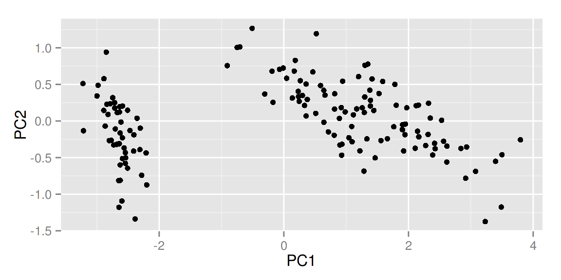
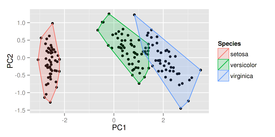
ggfortify 使 ggplot2 知道怎么诠释PCA对象。加载好 ggfortify 包之后, 你可以对stats::prcomp 和 stats::princomp 对象使用 ggplot2::autoplot。
library(ggfortify)
df <- iris[c(1, 2, 3, 4)]
autoplot(prcomp(df))
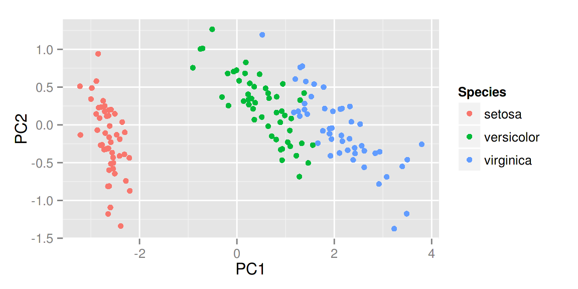
 你还可以选择数据中的一列来给画出的点按类别自动分颜色。输入
help(autoplot.prcomp) 可以了解到更多的其他选择。
autoplot(prcomp(df), data = iris, colour = 'Species')
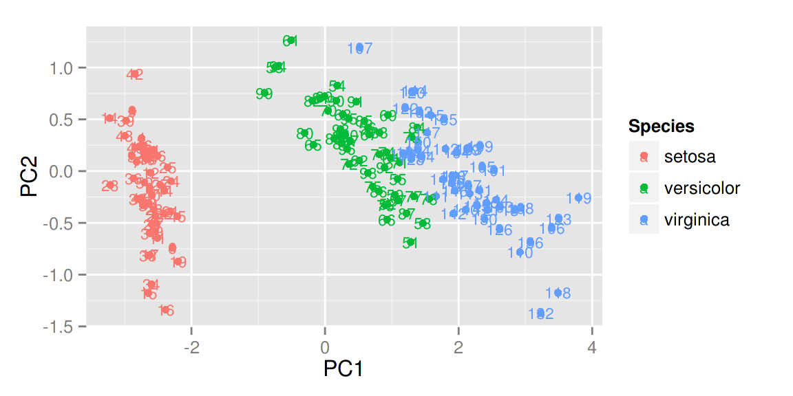
比如说给定label = TRUE 可以给每个点加上标识(以rownames为标准),也可以调整标识的大小。
autoplot(prcomp(df), data = iris, colour = 'Species', label = TRUE,label.size = 3)
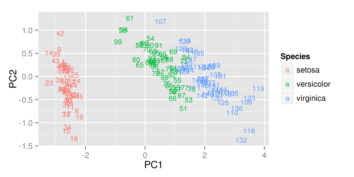
给定 shape = FALSE 可以让所有的点消失,只留下标识,这样可以让图更清晰,辨识度更大。
autoplot(prcomp(df), data = iris, colour = 'Species', shape = FALSE,label.size = 3)
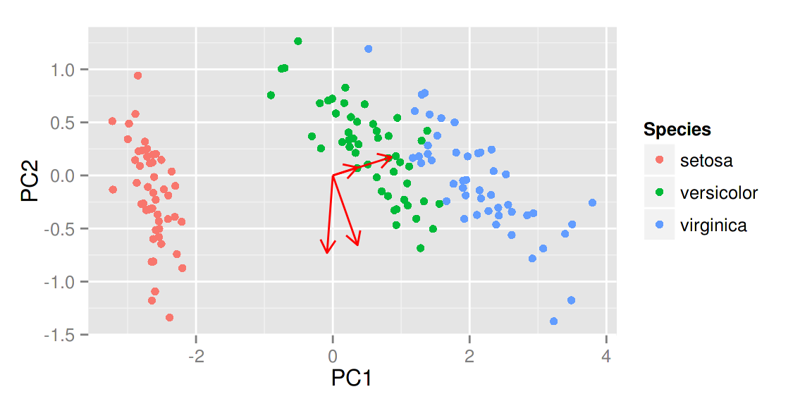
给定 loadings = TRUE 可以很快地画出特征向量。
autoplot(prcomp(df), data = iris, colour = 'Species', loadings = TRUE)
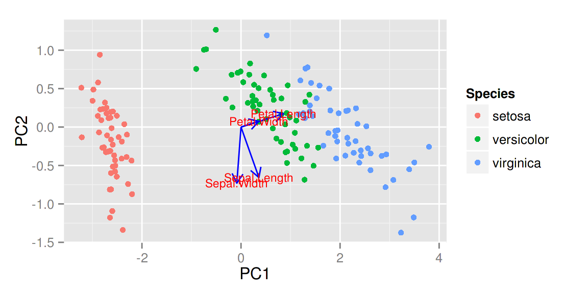
 同样的,你也可以显示特征向量的标识以及调整他们的大小,更多选择请参考帮助文件。
autoplot(prcomp(df), data = iris, colour = 'Species',
 loadings = TRUE, loadings.colour = 'blue',
loadings.label = TRUE, loadings.label.size = 3)
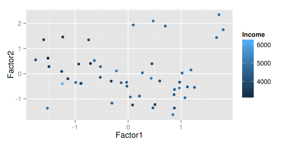
因子分析
和PCA类似,ggfortify 也支持 stats::factanal 对象。可调的选择也很广泛。以下给出了简单的例子:
注意 当你使用 factanal 来计算分数的话,你必须给定 scores 的值。
d.factanal <- factanal(state.x77, factors = 3, scores = 'regression')
autoplot(d.factanal, data = state.x77, colour = 'Income')
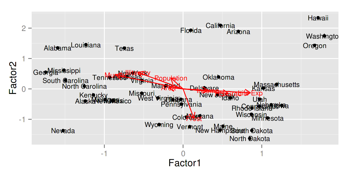
autoplot(d.factanal, label = TRUE, label.size = 3,
         loadings = TRUE, loadings.label = TRUE, loadings.label.size  = 3)
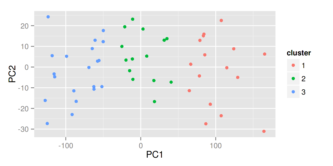
K-均值聚类
autoplot(kmeans(USArrests, 3), data = USArrests)
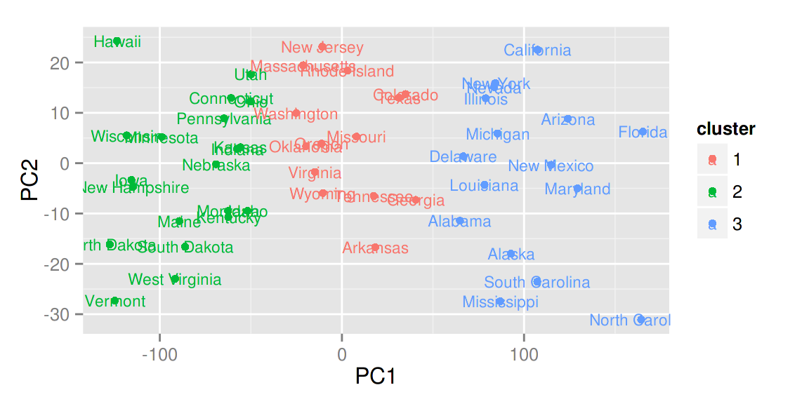
autoplot(kmeans(USArrests, 3), data = USArrests, label = TRUE,
         label.size = 3)
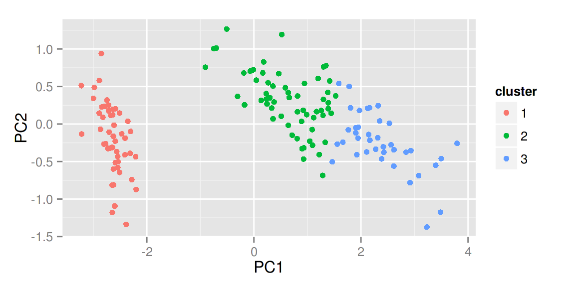
其他聚类
ggfortify 也支持 cluster::clara, cluster::fanny, cluster::pam。
library(cluster)
autoplot(clara(iris[-5], 3))
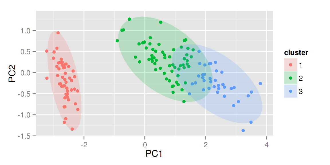
给定 frame = TRUE,可以把 stats::kmeans 和 cluster::* 中的每个类圈出来。
autoplot(fanny(iris[-5], 3), frame = TRUE)
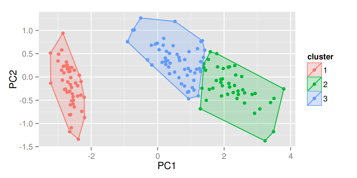
你也可以通过 frame.type 来选择圈的类型。更多选择请参照 ggplot2::stat_ellipse 里面的 frame.type 的 type 关键词。
autoplot(pam(iris[-5], 3), frame = TRUE, frame.type = 'norm')
更多关于聚类方面的可视化请参考 Github 上的 Vignette 或者 Rpubs 上的例子。
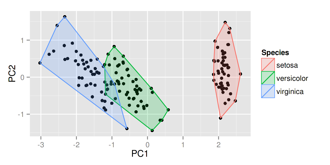
lfda(Fisher局部判别分析)
lfda 包支持一系列的 Fisher 局部判别分析方法,包括半监督 lfda,非线性 lfda。你也可以使用 ggfortify 来对他们的结果进行可视化。
library(lfda)
# Fisher局部判别分析 (LFDA)
model <- lfda(iris[-5], iris[, 5], 4, metric="plain")
autoplot(model, data = iris, frame = TRUE, frame.colour = 'Species')
# 非线性核Fisher局部判别分析 (KLFDA)
model <- klfda(kmatrixGauss(iris[-5]), iris[, 5], 4, metric="plain")
autoplot(model, data = iris, frame = TRUE, frame.colour = 'Species')
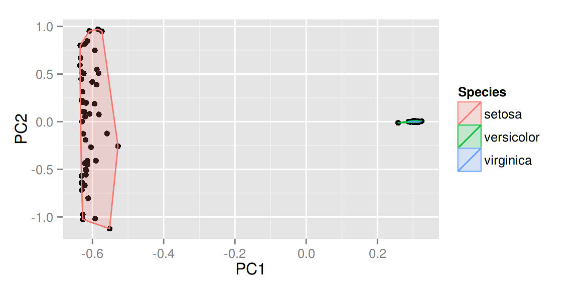 注意 对
注意 对iris数据来说,不同的类之间的关系很显然不是简单的线性,这种情况下非线性的klfda 影响可能太强大而影响了可视化的效果,在使用前请充分理解每个算法的意义以及效果。
# 半监督Fisher局部判别分析 (SELF)
model <- self(iris[-5], iris[, 5], beta = 0.1, r = 3, metric="plain")
autoplot(model, data = iris, frame = TRUE, frame.colour = 'Species')
时间序列的可视化
用 ggfortify 可以使时间序列的可视化变得极其简单。接下来我将给出一些简单的例子。
ts对象
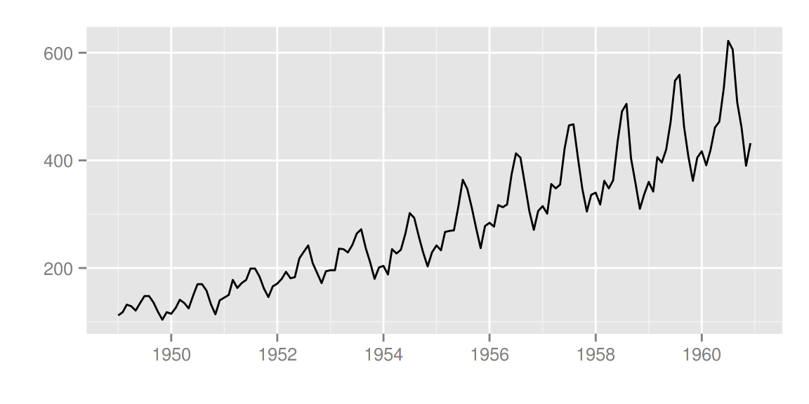
library(ggfortify)
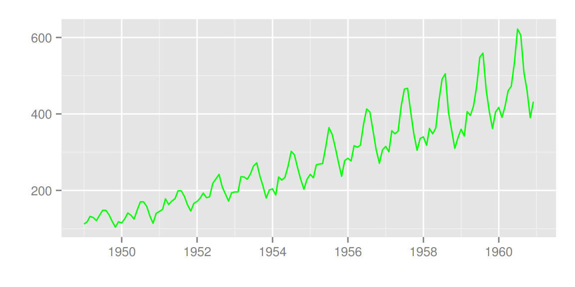
autoplot(AirPassengers)
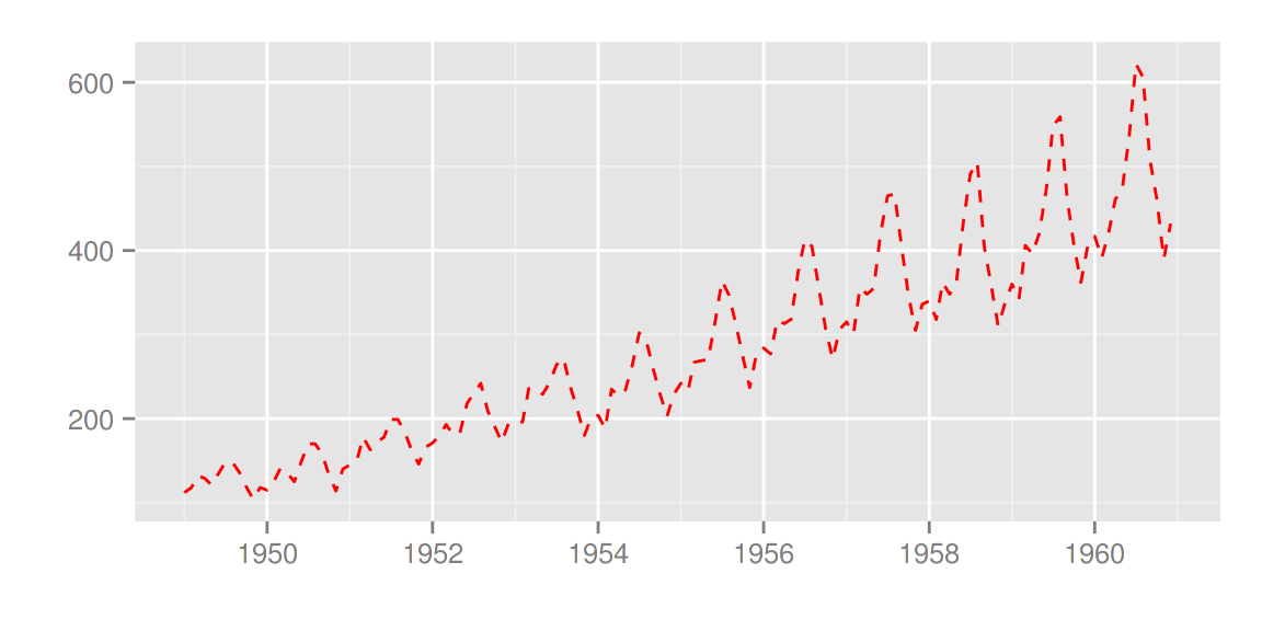
 可以使用
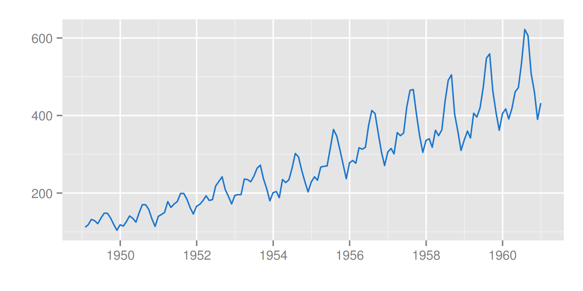
可以使用 ts.colour 和 ts.linetype 来改变线的颜色和形状。更多的选择请参考 help(autoplot.ts)。
autoplot(AirPassengers, ts.colour = 'red', ts.linetype = 'dashed')
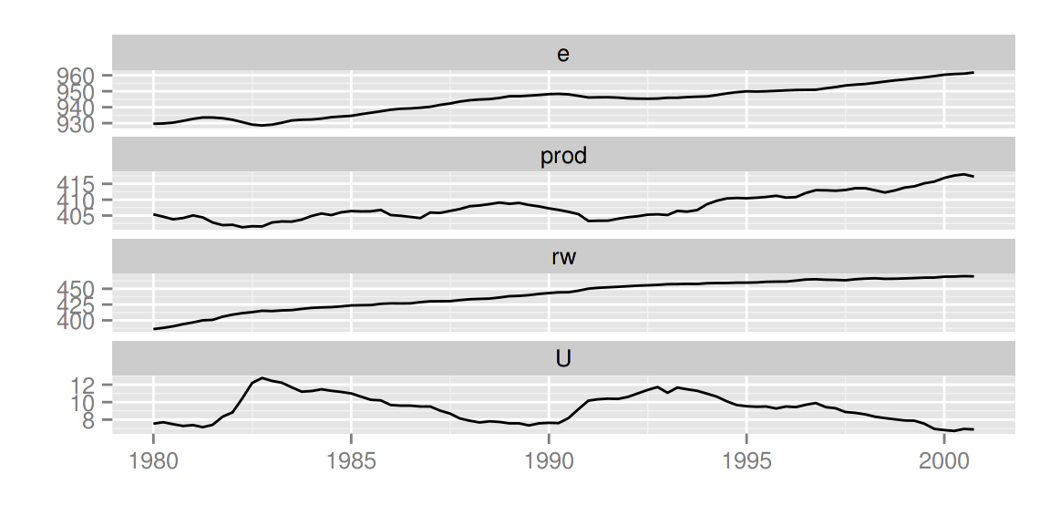
多变量时间序列
library(vars)
data(Canada)
autoplot(Canada)
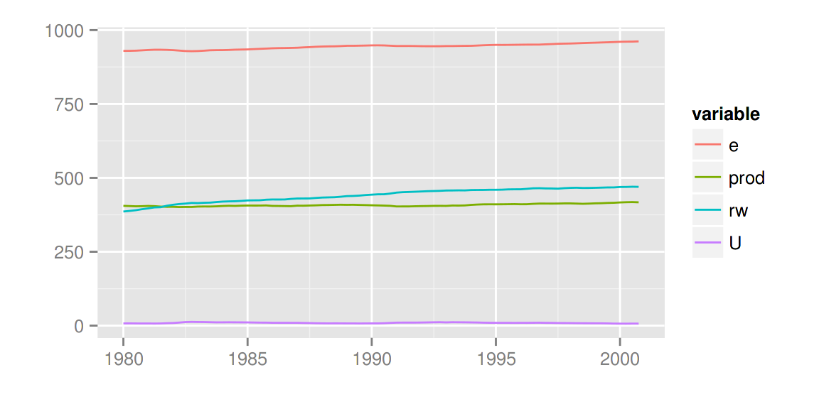
使用 facets = FALSE 可以把所有变量画在一条轴上。
autoplot(Canada, facets = FALSE)
autoplot 也可以理解其他的时间序列类别。可支持的R包有:
zoo::zooregxts::xtstimeSeries::timSeriestseries::irts
一些例子:
library(xts)
autoplot(as.xts(AirPassengers), ts.colour = 'green')
library(timeSeries)
autoplot(as.timeSeries(AirPassengers), ts.colour = ('dodgerblue3'))
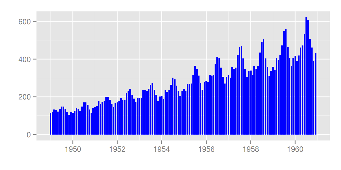
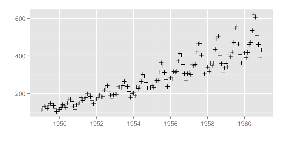
你也可以通过 ts.geom 来改变几何形状,目前支持的有 line, bar 和 point。
autoplot(AirPassengers, ts.geom = 'bar', fill = 'blue')
autoplot(AirPassengers, ts.geom = 'point', shape = 3)
forecast包
library(forecast)
d.arima <- auto.arima(AirPassengers)
d.forecast <- forecast(d.arima, level = c(95), h = 50)
autoplot(d.forecast)
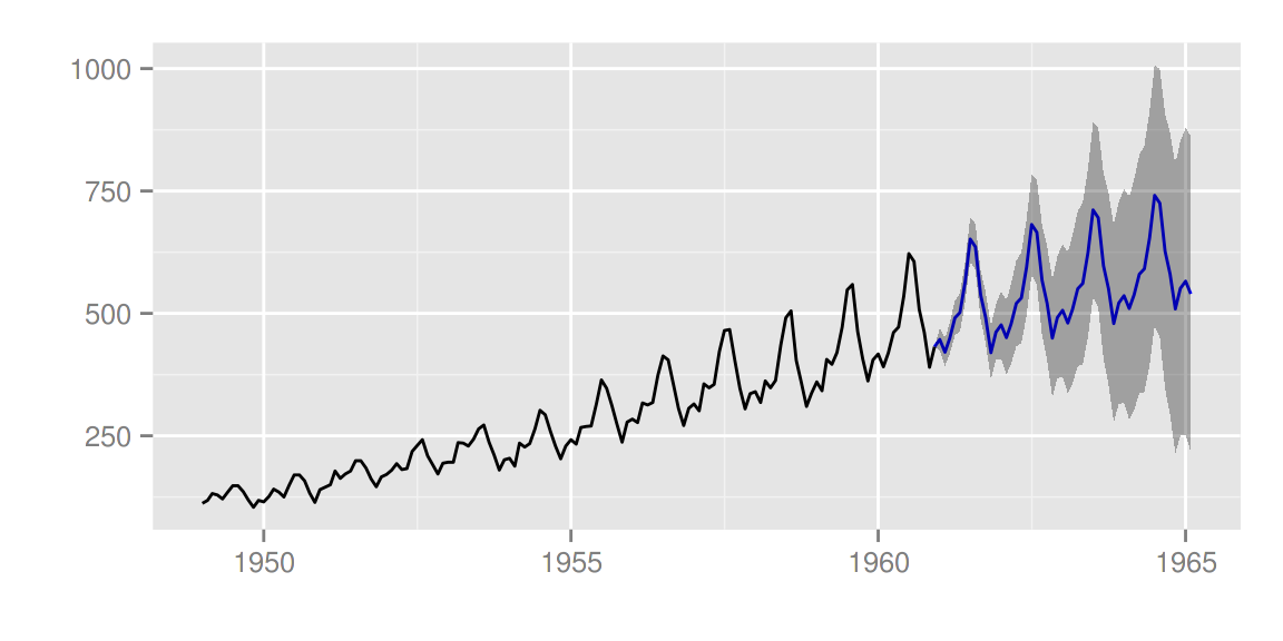 有很多设置可供调整:
autoplot(d.forecast, ts.colour = 'firebrick1', predict.colour = 'red',
         predict.linetype = 'dashed', conf.int = FALSE)
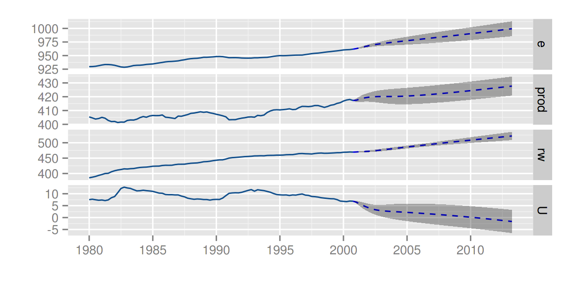
vars包
library(vars)
data(Canada)
d.vselect <- VARselect(Canada, lag.max = 5, type = 'const')$selection[1]
d.var <- VAR(Canada, p = d.vselect, type = 'const')
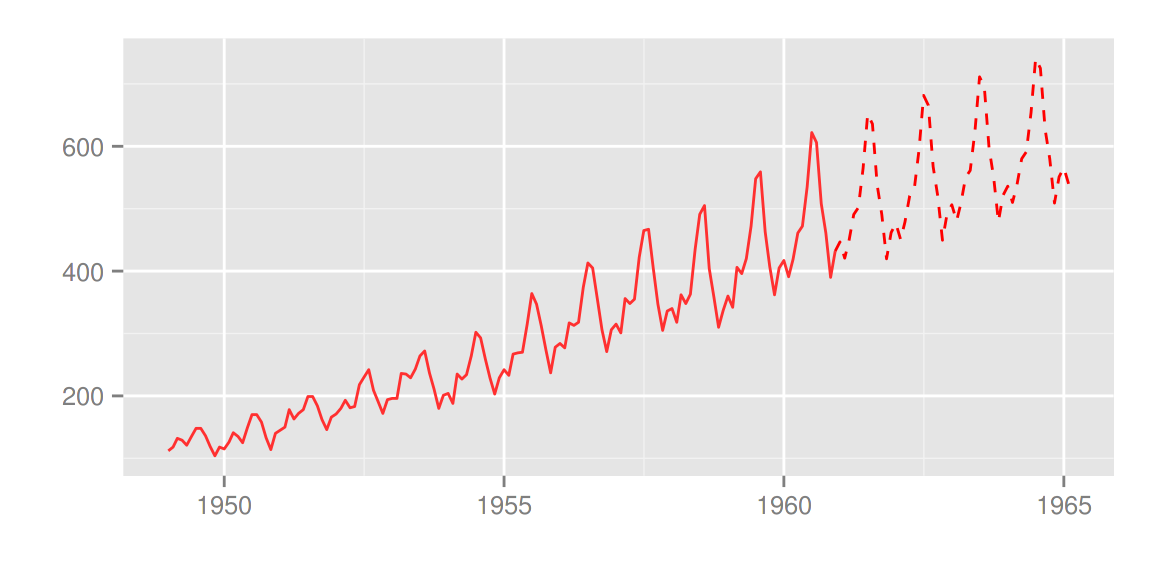
autoplot(predict(d.var, n.ahead = 50), ts.colour = 'dodgerblue4',
predict.colour = 'blue', predict.linetype = 'dashed')
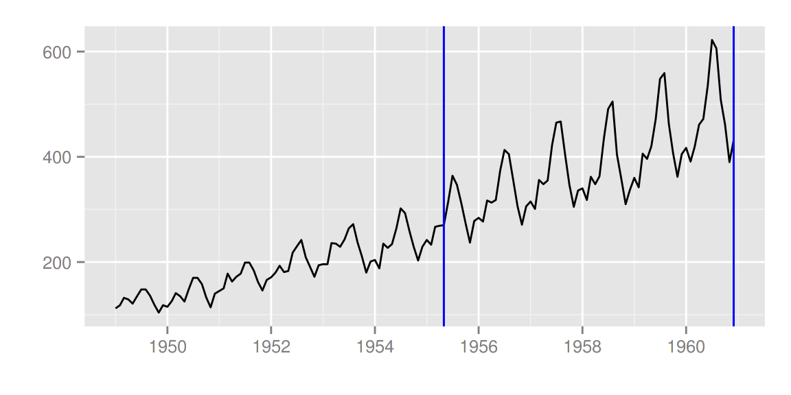
changepoint包
library(changepoint)
autoplot(cpt.meanvar(AirPassengers))
autoplot(cpt.meanvar(AirPassengers), cpt.colour = 'blue', cpt.linetype = 'solid')
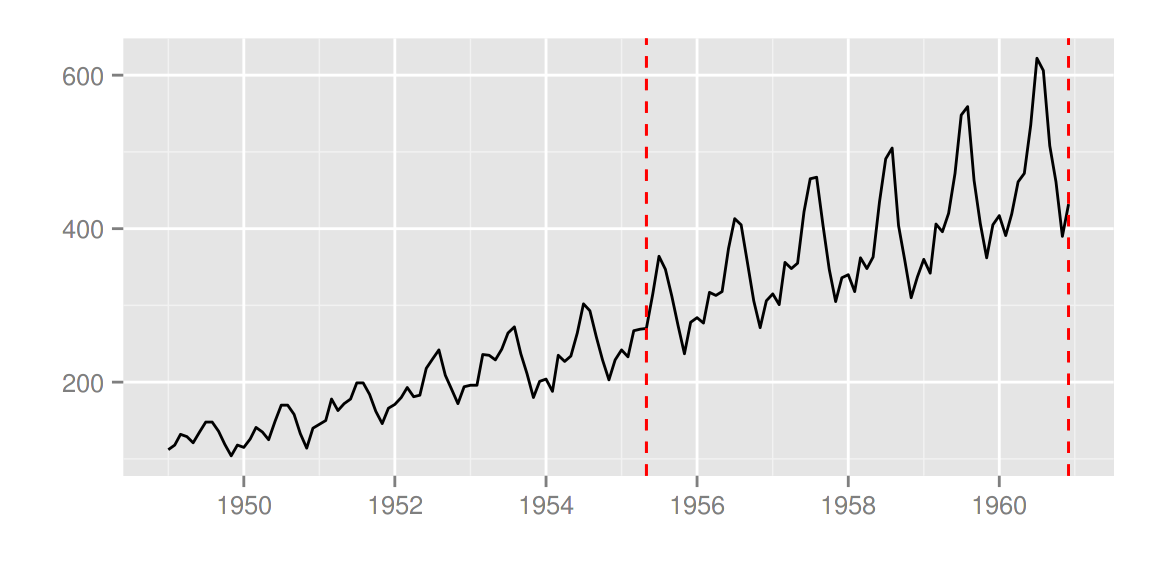
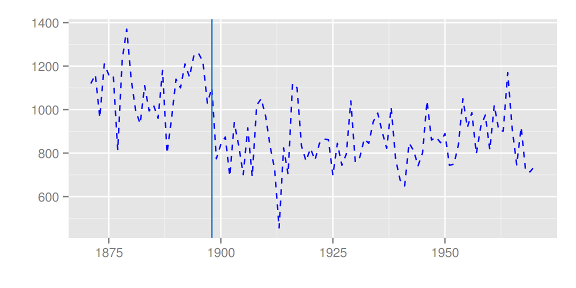
strucchange包
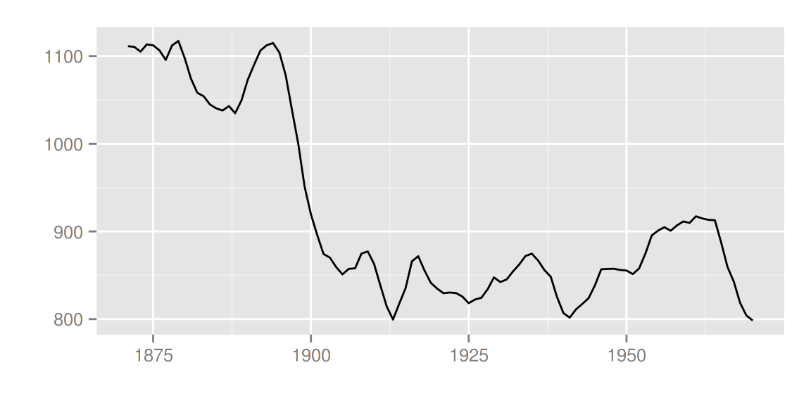
library(strucchange)
autoplot(breakpoints(Nile ~ 1), ts.colour = 'blue', ts.linetype = 'dashed',
cpt.colour = 'dodgerblue3', cpt.linetype = 'solid')
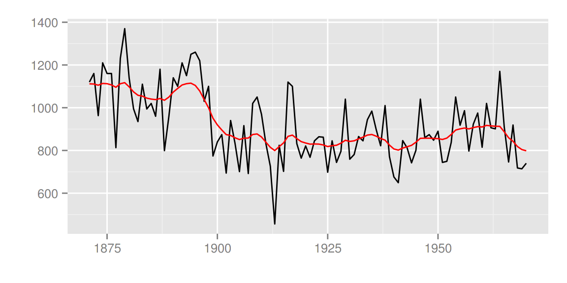
dlm包
library(dlm)
form <- function(theta){
dlmModPoly(order = 1, dV = exp(theta[1]), dW = exp(theta[2]))
}

model <- form(dlmMLE(Nile, parm = c(1, 1), form)$par)
filtered <- dlmFilter(Nile, model)

autoplot(filtered)
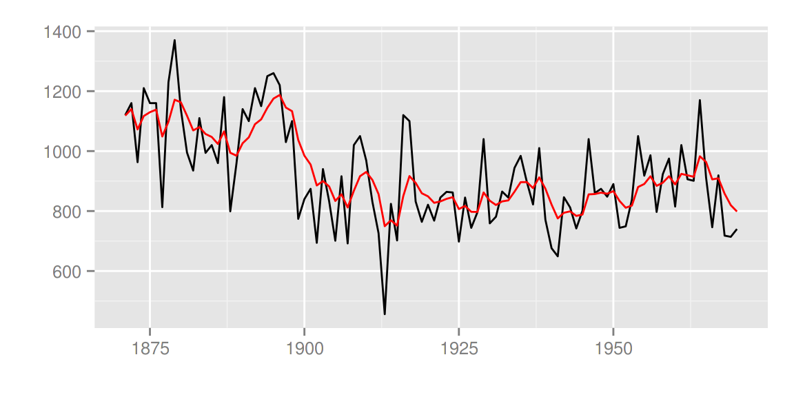
autoplot(filtered, ts.linetype = 'dashed', fitted.colour = 'blue')
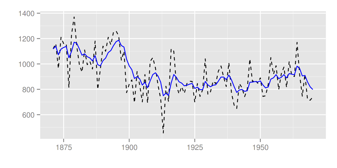
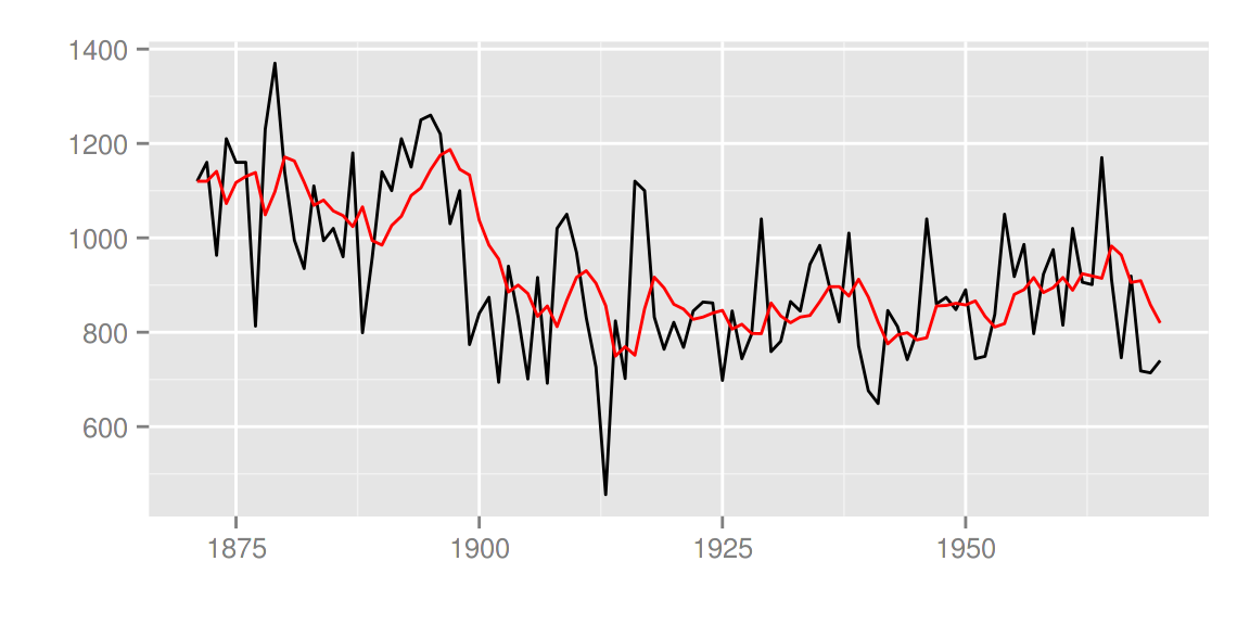
smoothed <- dlmSmooth(filtered)
autoplot(smoothed)
p <- autoplot(filtered)
autoplot(smoothed, ts.colour = 'blue', p = p)
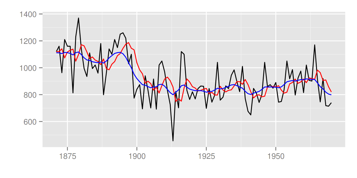
KFAS包

library(KFAS)
model <- SSModel(
Nile ~ SSMtrend(degree=1, Q=matrix(NA)), H=matrix(NA)
)
fit <- fitSSM(model=model, inits=c(log(var(Nile)),log(var(Nile))),
              method="BFGS")
smoothed <- KFS(fit$model)
autoplot(smoothed)
使用 smoothing='none' 可以画出过滤后的结果。
filtered <- KFS(fit$model, filtering="mean", smoothing='none')
autoplot(filtered)
trend <- signal(smoothed, states="trend")
p <- autoplot(filtered)
autoplot(trend, ts.colour = 'blue', p = p)
stats包
可支持的stats包里的对象有:
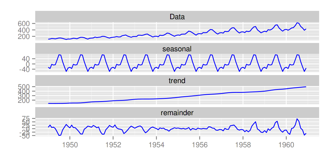
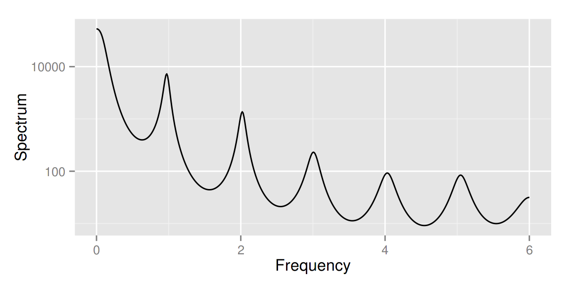
stl,decomposed.tsacf,pacf,ccfspec.ar,spec.pgramcpgram
autoplot(stl(AirPassengers, s.window = 'periodic'), ts.colour = 'blue')
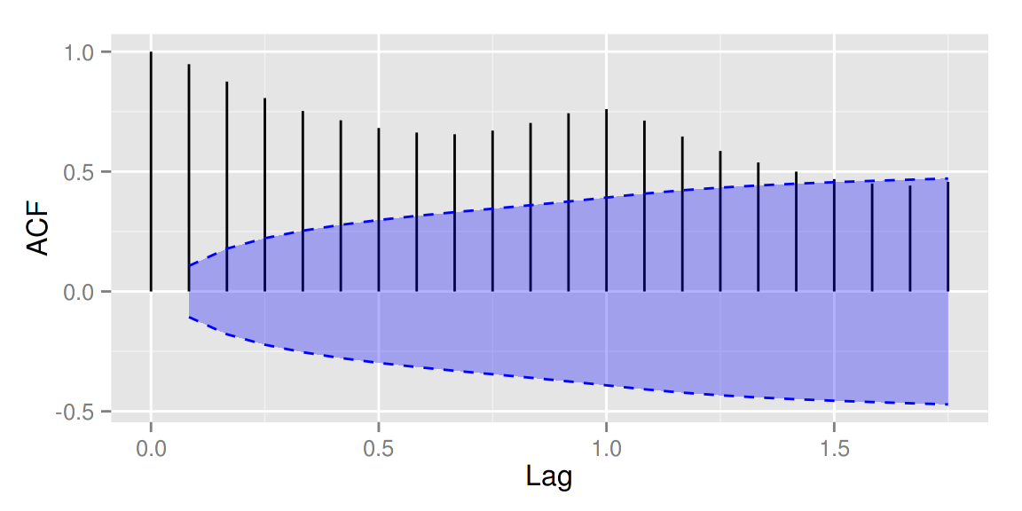
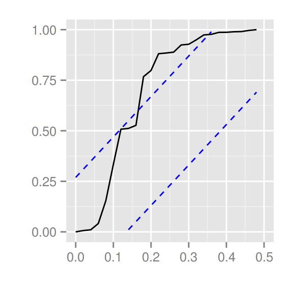
autoplot(acf(AirPassengers, plot = FALSE))
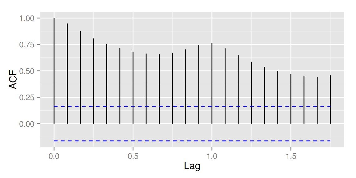
autoplot(acf(AirPassengers, plot = FALSE), conf.int.fill = '#0000FF',
         conf.int.value = 0.8, conf.int.type = 'ma')
autoplot(spec.ar(AirPassengers, plot = FALSE))
ggcpgram(arima.sim(list(ar = c(0.7, -0.5)), n = 50))
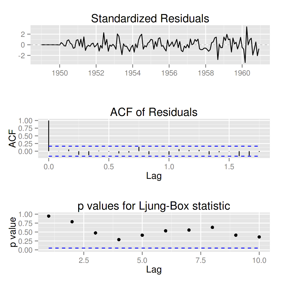
library(forecast)
ggtsdiag(auto.arima(AirPassengers))
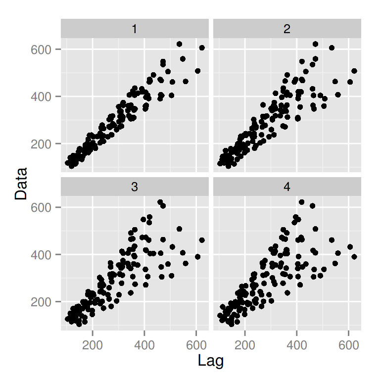
gglagplot(AirPassengers, lags = 4)
更多关于时间序列的例子,请参考 Rpubs 上的介绍。
最近又多了许多额外的非常好用的功能,比如说现在已经支持 multiplot 同时画多个不同对象,强烈推荐参考 Rpubs 以及关注我们 Github 上的更新。
祝大家使用愉快!有问题请及时在Github上 报告。(可以使用中文)
关于作者
唐源目前在蚂蚁金服担任技术专家,专注于建立AI基础架构和自动机器学习平台, 是多个开源软件的作者,XGBoost和Apache MXNet的项目管理委员会成员,Kubeflow的联合主席,TensorFlow、Couler、以及ElasticDL的Committer。同时也是《TensorFlow实战》以及《动手学深度学习》的作者之一。 个人主页:https://terrytangyuan.github.io/about/ |
敬告各位友媒,如需转载,请与统计之都小编联系(直接留言或发至邮箱:editor@cos.name),获准转载的请在显著位置注明作者和出处(转载自:统计之都),并在文章结尾处附上统计之都微信二维码。

发表/查看评论